
Design Tips for Non-Designers: Creating Charts That Don’t Lie
As someone who does a lot with design in her work, I have several design pet peeves. The obvious ones, of course, are designs incorporating Comic Sans or Papyrus, but 3-D graphs rank up there in surprising ways.
Having just run into an example of this in a Financial Peace University lesson, I happened to mention it to one of our User Experience Practitioners. Despite her years of experience and the fact that she’d even gone to one of Tufte’s courses (he specializes in data representation), she wasn’t aware that this particular visual representation of data tended to be a misrepresentation of data.
Now, this is definitely not a slam against her. She’s very intelligent and a good designer. Really, it occurred to me that it’s the sort of thing you have to be shown to notice. (I, for example, learned about it in grad school.) And it also occurred to me that if she wasn’t aware of this problem, others with much less experience than her would certainly not know about it.
So: A crash course in how to NOT represent data. For those of you in academia, this is particularly relevant as you create charts for presentations or research articles. But even if you’re not the one designing the data (say, a passive reader of magazines), it’s good to know that this sort of data misrepresentation exists. Honestly, once you see it once it’ll bug you every time you see it in the future.
Three Bad Representations of Data
First, let’s take a look at these three charts:
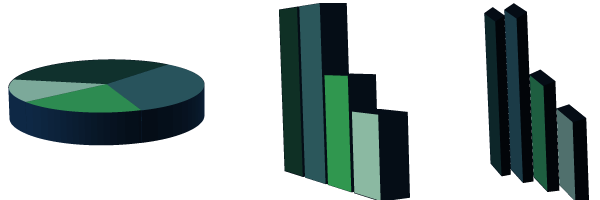
In the pie chart, it looks like the light blue slice is about half the size of the light green one, and the largest slice is the dark green one in the back.
In the middle chart (the first bar chart), it looks like the dark green bar is probably smaller than the dark blue one.
In the right bar chart, the dark green bar is distinctly smaller than the dark blue one. The light blue bar on the right is about half the size of the dark green and about a third the size of the dark blue.
Sound about right? Good. Now let’s see how the data looks flat:
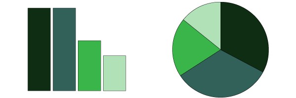
Vastly different, right? Even the colors look different from above. And yet all five charts were built using the same data set and the same colors.
Here are the 3-D charts again:
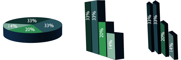
So what’s going on here? If you squint (kind of like those old MagicEye pages), you can sort of see the correlation of the numbers to the sizes, especially for the center chart.
In a word, it’s all about perspective. You know, that thing you probably didn’t quite grasp in elementary school art classes. It’s the concept that allows you to close one eye and put your index finger and thumb together as if you’re pinching someone’s head. It’s why the moon looks like it’s the same size as a penny. And it skews data.
 Granted, I was intentionally trying to skew the data. I messed around in Illustrator. I played with the perspective tool in addition to the standard 3-D tool. The third chart exists not because I think it appears commonly but because I didn’t think the second one skewed my data enough, so I did everything I could to mess with the perspective (see my hackneyed illustration). Data manipulation to that extreme is pretty rare in the wild. But it’s important to note that I did not manually resize anything. Everything was done by using Illustrator’s standard chart tool and messing around with the angle and perspective.
Why does this happen?
There are two main reasons.
First, creating charts this way is both pretty and easy. I believe the native option in PowerPoint these days is a 3-D graph. Even if it isn’t, it’s the Comic Sans of chart design: it’s easy to do and it makes most people think that you spent more time thinking through the design than you actually did. And that requires no knowledge of good design principles. A professional graphic designer who isn’t concerned with data representation can make an absolutely fantastic-looking 3-D chart. Even with my limited design skills, which versions are prettier: the 2-D ones, or the 3-D ones?
The second reason is, of course, intentional data manipulation. Let’s say I’m working on my doctoral dissertation on how much people love 3-D charts. I’ve conducted a survey with the following results:
- 33% hate them
- 20% are indifferent
- 33% like them
- 14% love them
Now, if I’m trying to emphasize how much people hate them, I’d probably use the 3-D pie chart. The 14% who love them would be minimized. If I’m really taking time with the design (which I didn’t), I’d mess around even more to make the 33% who hate them look as big as possible. If I’m lucky, my overtaxed committee won’t notice that I’ve skewed the data; they’ll just glance at the chart and move on with life, thinking that a much smaller percentage loved them than actually did. My dissertation is approved, I magically get tenure at Harvard in 0.02 seconds for my brilliant research, and nobody’s the wiser.
An absurd example, sure. But now imagine you’re being shown this chart by a salesman, and the question is “How many people have found *expensive add-on* to be valuable?” Or you’re reading an essay on a diet soda website and this chart is being used to illustrate the connection between artificial sweeteners and cancer? Wouldn’t you want it visually clear that, wait, 14% of people who drink just one diet soda a day get cancer at some point in their lives?
(Chances are, these are more extreme examples than you’ll ever face. But just as a reminder, Tufte has argued that one of the reasons the Space Shuttle Challenger exploded on takeoff was that the engineers didn’t properly format the data so their superiors could understand the dangers. Sometimes proper document formatting really is a matter of life-or-death!)
What to do
Now that you’re aware of why 3-D graphs are problematic, what should you do with the knowledge (other than be distracted and irritated every time you see one)?
First, don’t use them yourself. Next time you have to do a presentation or write a TPS report or whatever, make sure you only use 2-D graphs. It’s entirely possible to make a pretty 2-D graph, but even if you don’t want to take the time, clarity is much more important than attractiveness.
Also, next time you see a 3-D graph in the wild, take the time to look closely at the data. Chances are good it was created that way because it looked nicer and the designer wasn’t intentionally manipulating the data, but somebody could be trying to push their own agenda as well.